
A leader in the grief industry needed a brand that would differentiate her organization and catalyze conversation. The problem identified was a stale brand lost in a sea of counseling and end of life companies. It no longer served the brands intent to pivot into new business models, nor was it compatible with the breadth of digital products being launched across B2B and B2C verticals.
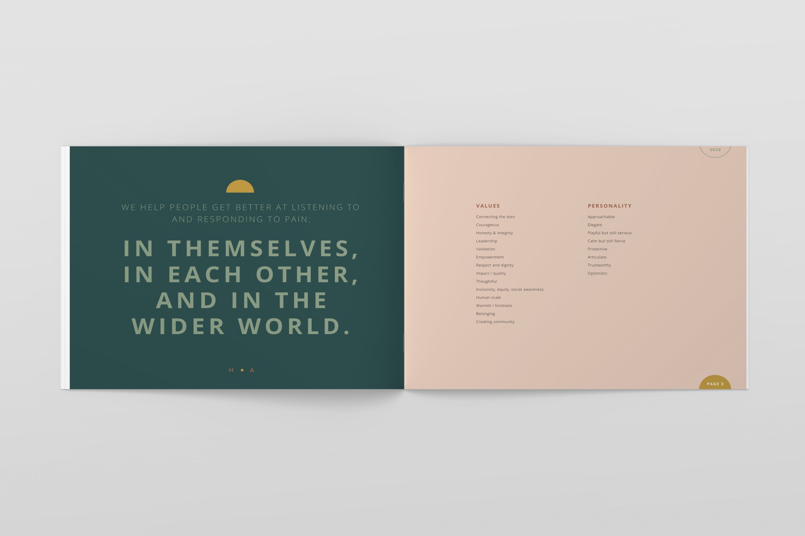
After studying the broader grief industry, Jill defined a new visual identity based on the organization’s existing brand platform. The concept needed to be welcoming and accessible to a fatigued audience with compromised cognitive capacity. The new look is a radical departure from the previous brand, but achieves the organization’s goal of differentiation, accessibility, and audience trust.
Brand Management
- Brand creation
-
Brand guidelines and execution
Art Direction
- Creative strategy and oversight
- Logo and website design
Design
- Visual identity and website (coming soon)
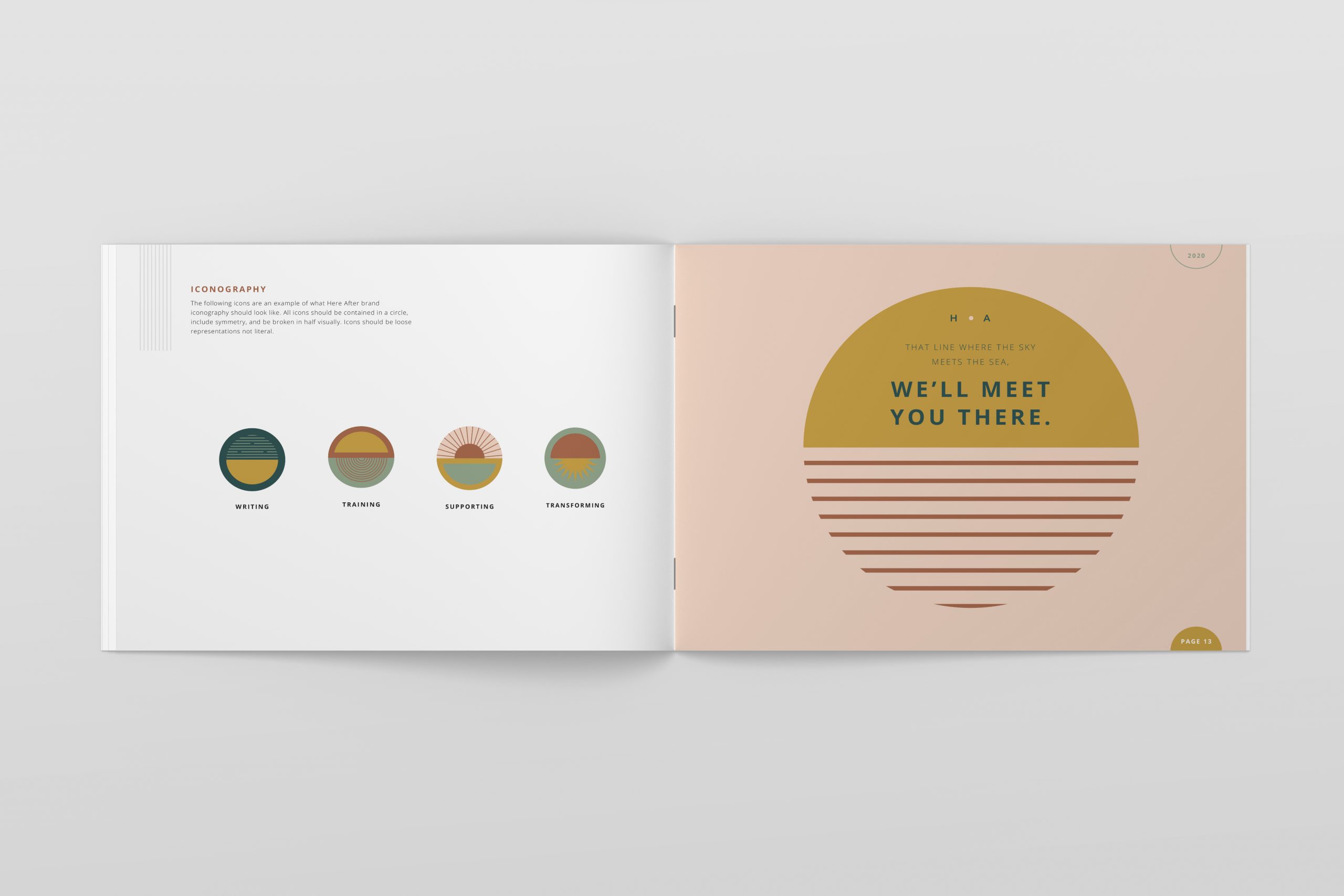
Here After Logo
Here After Brand Color Palette and Fonts
Jill created a friendly, approachable color palette reflecting brand values.
Protective
Calm
Approachable
Bold
Elegant
Open Sans
Aa
A B C D E F G H I J K L M N O P Q R S T U V W X Y Z a b c d e f g h i j k l m n o p q r s t u v w x y z
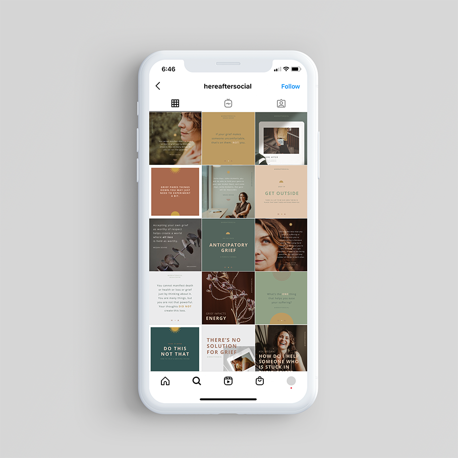
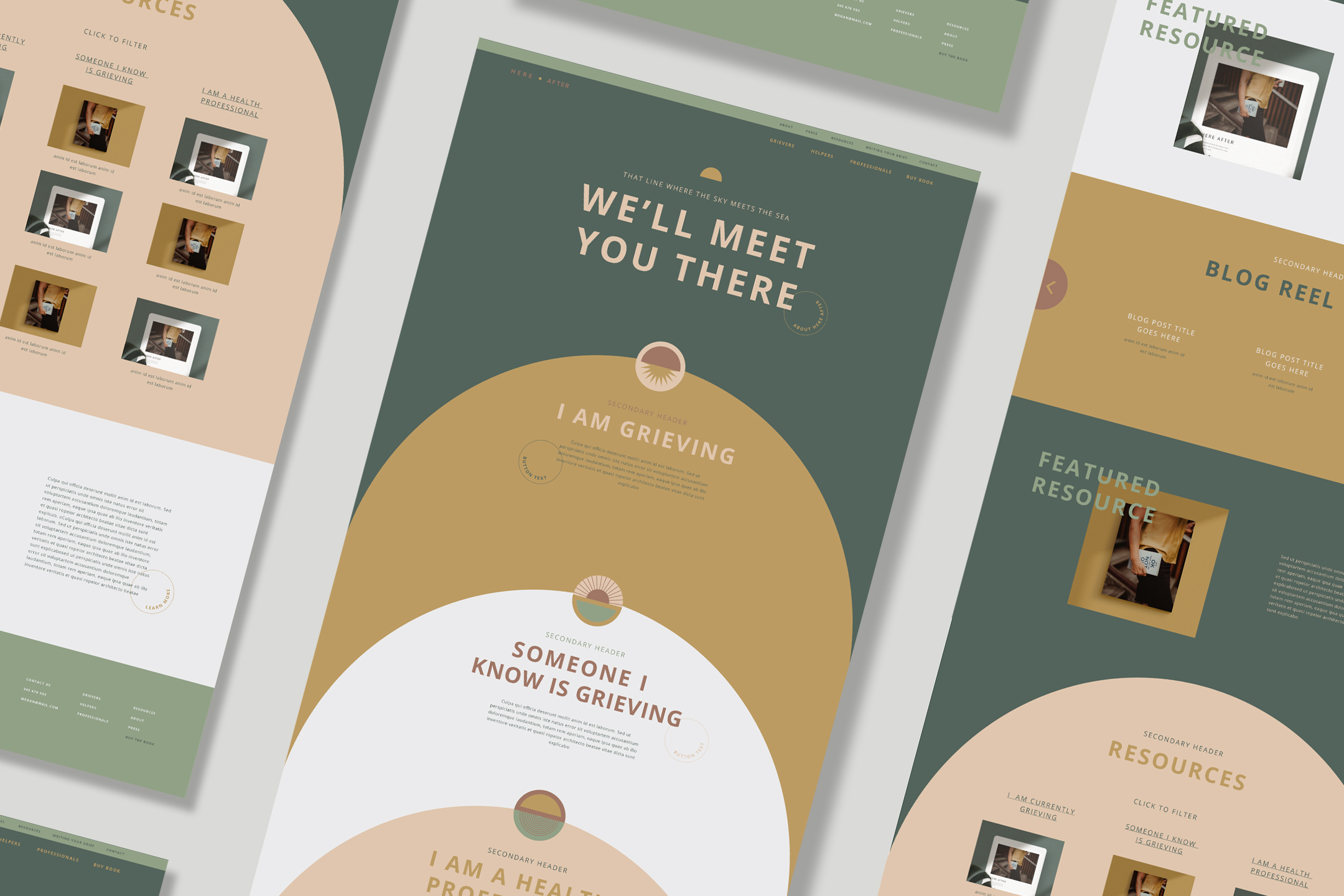
Collateral and Digital Samples
Credits: Creative Director: Kassia Binkowski at onekcreative.